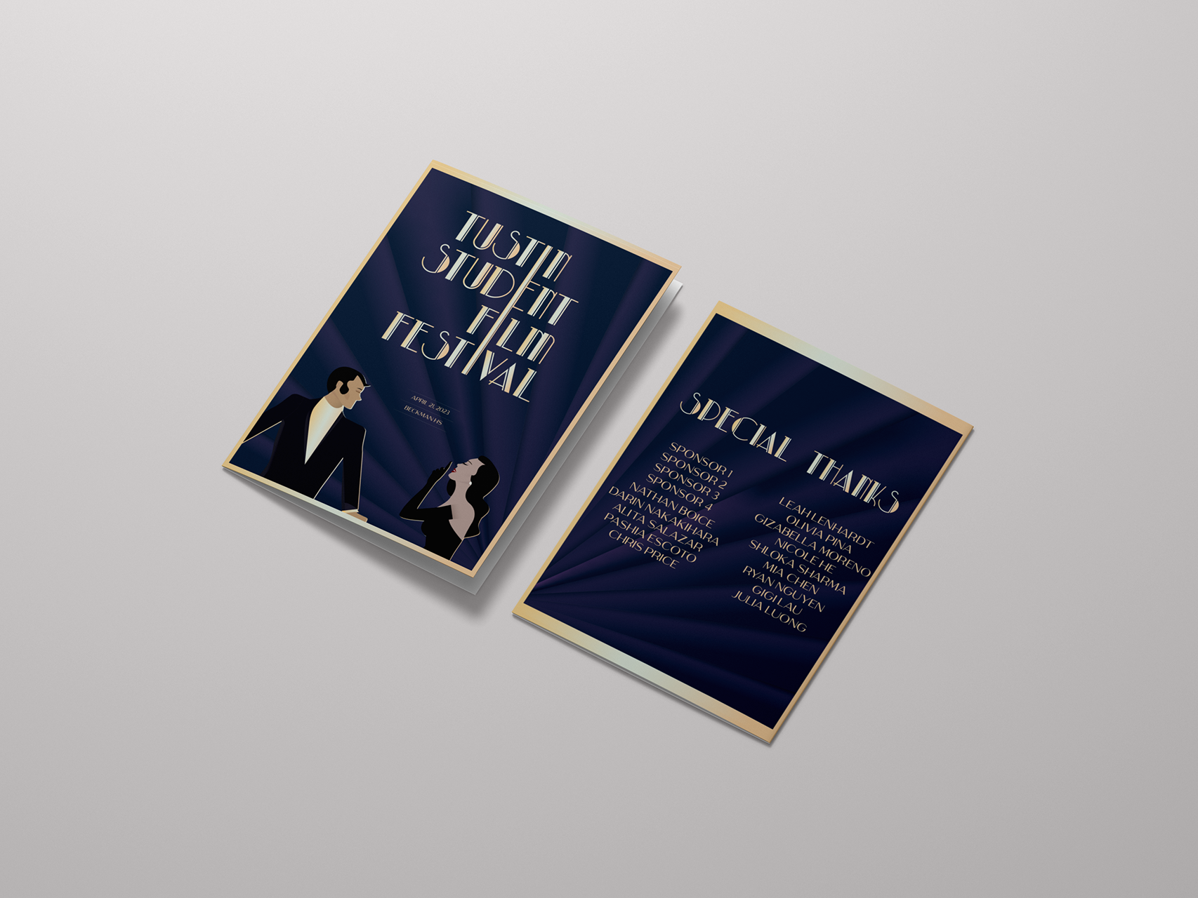
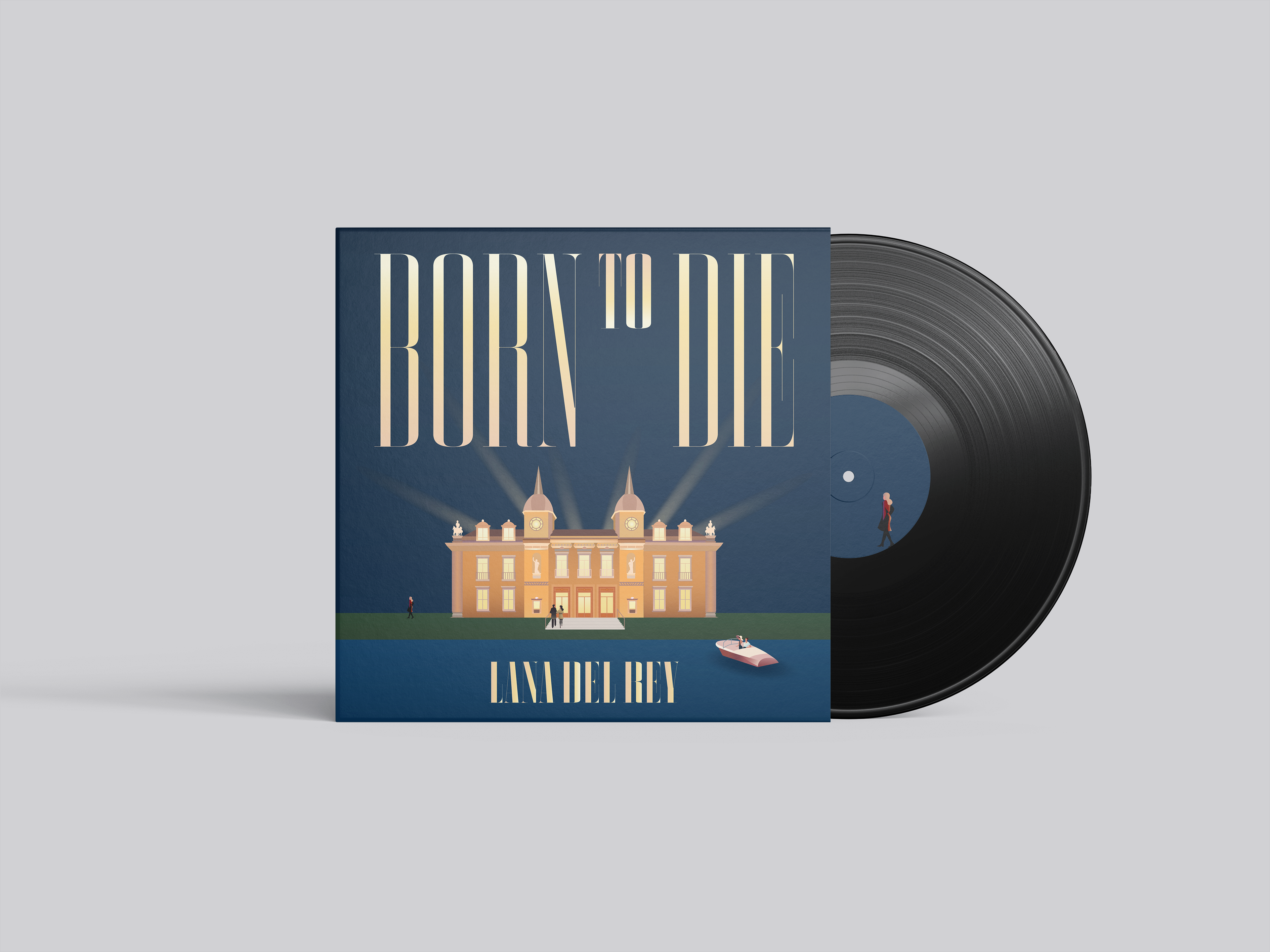

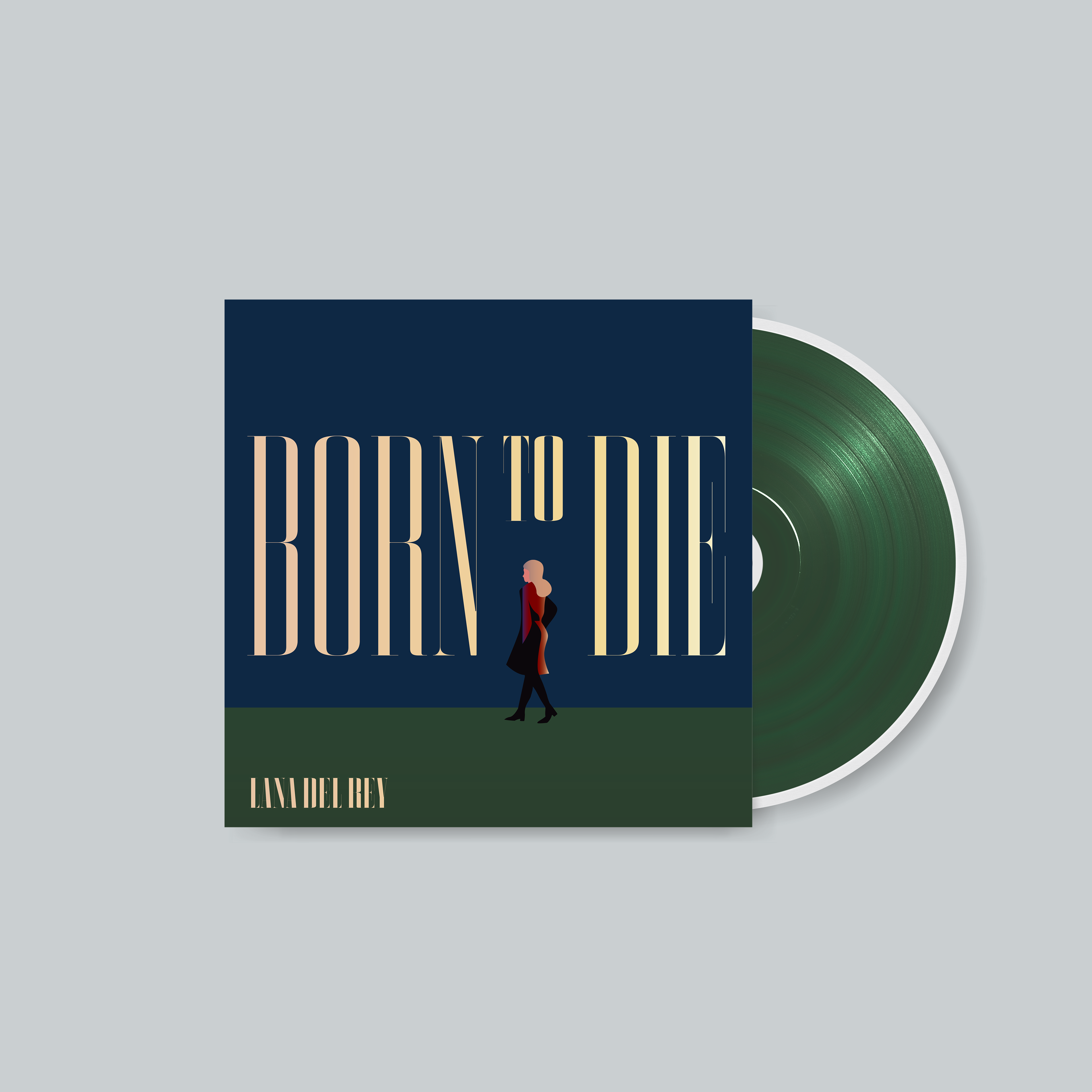


Our brief was to redesign our favorite album using illustrations. Inspired by the opulence of Monte Carlo and Lake Como, this rebrand channels Lana Del Rey's thematic allusions to The Great Gatsby, using illustrated characters to embody the decadence and disillusionment of contemporary society.
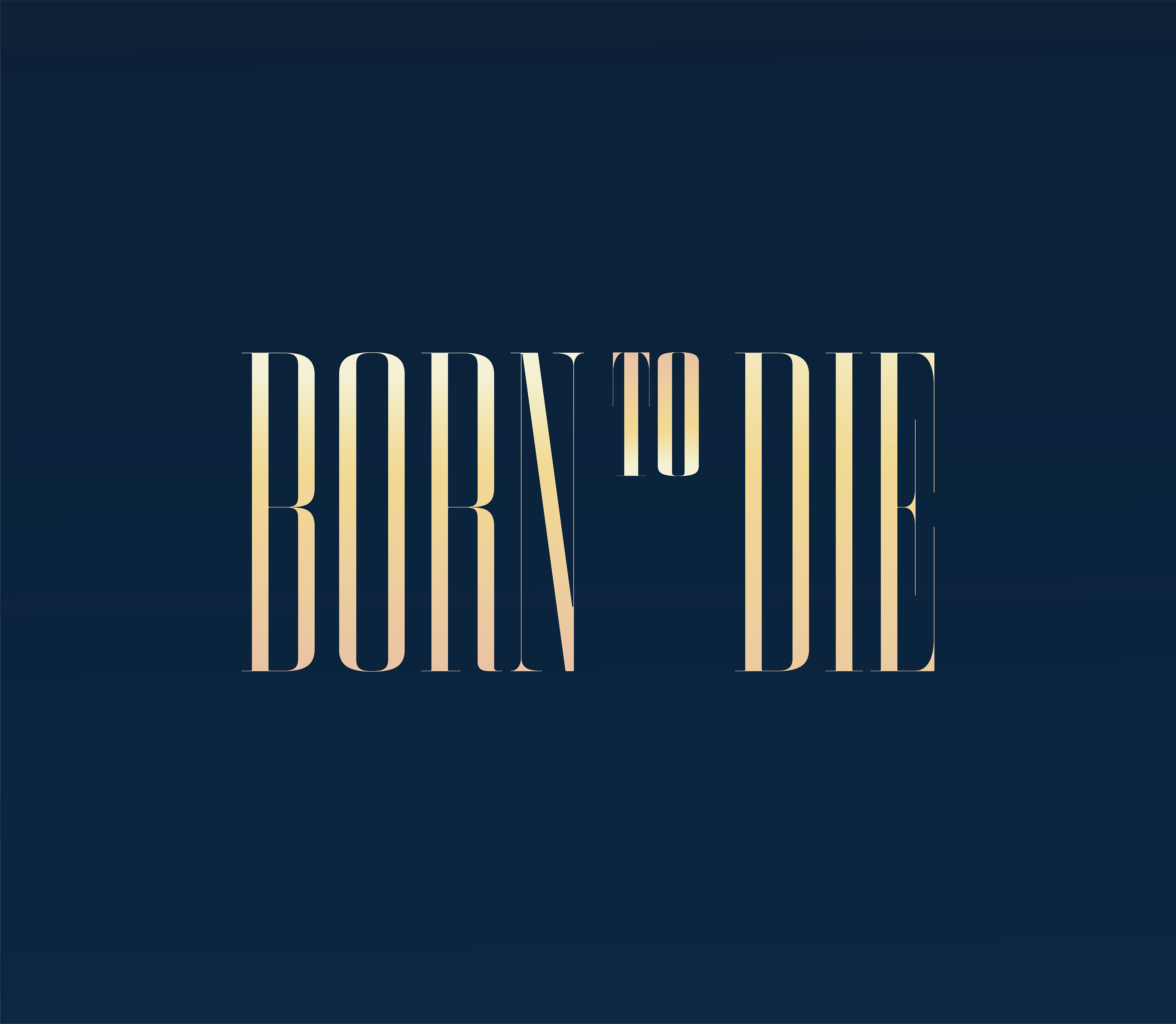
With European-inspired illustrations, I used neoclassical architecture for the typography to reflect the Americana essence of the songs. This contrast highlights Lana Del Rey’s themes of borrowed time and the fleeting nature of beauty in a nostalgic yet gritty American Dream. The naval blue, champagne, and peach palette evokes the album’s melancholic imagery through contrast.